
Typography is an essential aspect of your overall design and can make or break your content. With digital technology, it’s easier than ever to customize a typeface by changing its size, weight and positioning. These adjustments have the power to alter both the mood and meaning of your content. When you control the typeface, you also control how your audience experiences your message. Keep these three things in mind next time you’re choosing a typeface for your design.
Set your goal:
Set a goal and a mood for your content. What are you trying to convey? Your typeface and your message should work together to create a successful design, For example, if your goal is to bring awareness to lack of proper child nutrition around the world, you shouldn’t use a fun, playful typeface. Instead, choose a sympathetic, professional typeface that will complement your subject matter.
Legibility and Readability:
Legibility and readability are also important when choosing your typeface. It doesn’t matter what you’re trying to say. If your audience can’t read it, you won’t get your message across. Pick a typeface that is legible for your medium. A common trend in online design, san serif typefaces are often used to improve readability. Good typography helps your audience read your content. You don’t want to put a light colored typeface against a white background or pick contrasting colors that make your message difficult to read.
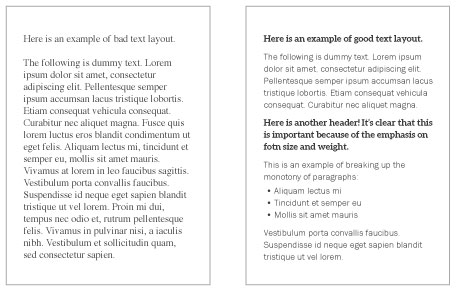
Layout and Size:
If your online content looks like a page out of a book, your audience will tune you out. To draw your audience’s eye to your content and create consumer interest in your page, establish a typeface hierarchy. Highlight the most important parts of your message by changing the style and size of your typeface. Proper typeface size and layout guides your audience through your content, giving them a positive online experience and getting your message across.
Picking a typeface can be a difficult decision, but if you follow these tips, you’ll keep your customers interested by creating both a beautiful and functional design.